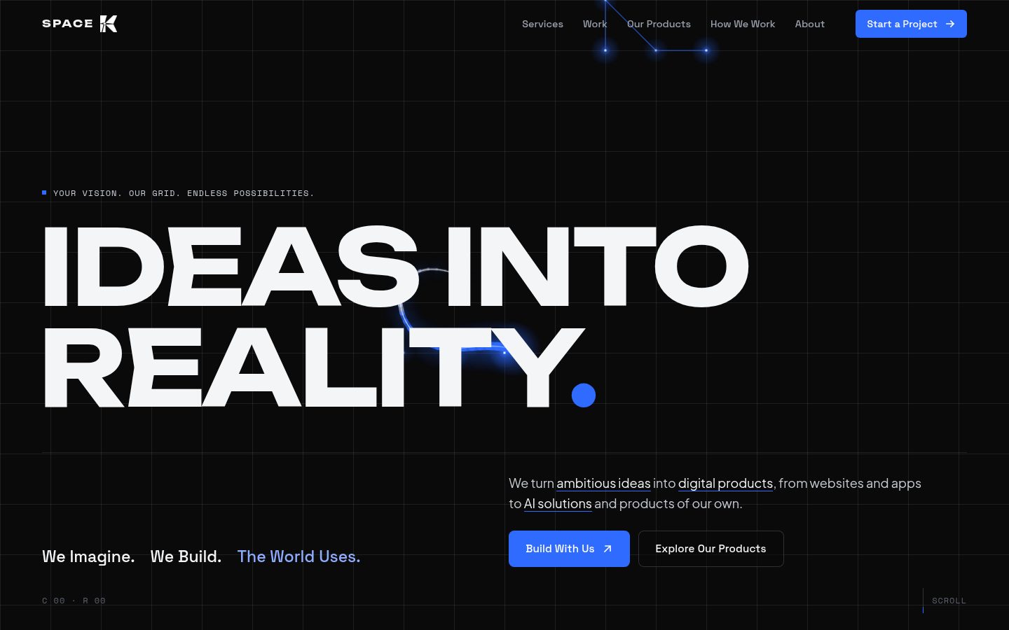
Case study
I started Space K in January 2026 to build websites, apps and AI tools, a lot of it for businesses that don’t have a website yet. The company site is the first thing a possible client sees, so it had two jobs: prove we can build ambitious things, and still make sense to a shop owner who has never hired a developer.
- Role
- Founder. I designed and built the site on my own.
- Client
- Space K, my own studio
- Timeline
- 2026, about a week from first sketch to launch
- Tools
- Figma, GSAP, Lenis, three.js, Firebase Hosting
- Live
- spacek.site
The problem
Space K talks to two kinds of people. One is the business owner: a restaurant, a salon, a mechanic. They don’t care what a site is built with. They want to know if it will bring customers, how soon it can be live and whether they’ll own it.
The other is the founder with a product idea, who judges a studio by how its own site feels. One group needs plain reassurance, the other needs proof of craft. A standard agency template would have given neither of them a reason to stay.
What I had to work with
- Most of the people I’m selling to will open the link on a phone, often on mobile data. The site promises client sites that load fast on 3G, so Space K’s own site couldn’t be the slow one.
- I wanted real motion, a WebGL globe and a live canvas grid, without that costing load time. The grid caps its pixel density and stops drawing when there’s nothing on screen to animate.
- As a new studio I had one finished client project I could show in depth, Sodyk, and our own product, Collabo, which was still in alpha. The page had to make a strong case without a long list of past work.
Key decisions
Four choices shaped the site more than anything else.
- 01
The grid is the brand, not a background
The small line above the hero headline reads “Your vision. Our grid. Endless possibilities.” I took that literally and made the grid something you can touch. Move the cursor and the cell under it lights up, while a small readout in the corner shows its column and row.
The same grid runs behind the whole page at a different strength in each section. It’s strongest in the hero and at the final call to action, and switched off behind the case study so the client’s work is the only thing you look at.
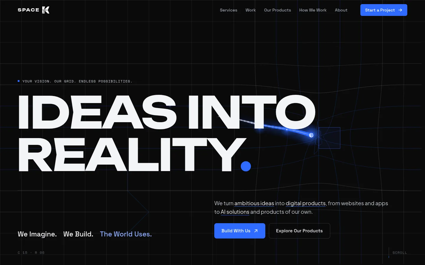
The hero. The cell under the cursor lights up, and the readout bottom left shows where you are on the grid. - 02
Show the customer’s problem before the services
Right after the hero there’s a globe, not a service list. It makes one point: over half of the world’s businesses still don’t have a website. The next section spells out what that costs, comparing a business that’s online with one that isn’t, row by row. The 54.2% comes from my own desk research, pulling together figures from published articles.
A business owner has to see what they’re missing before “website development” means anything to them. The services come after that.
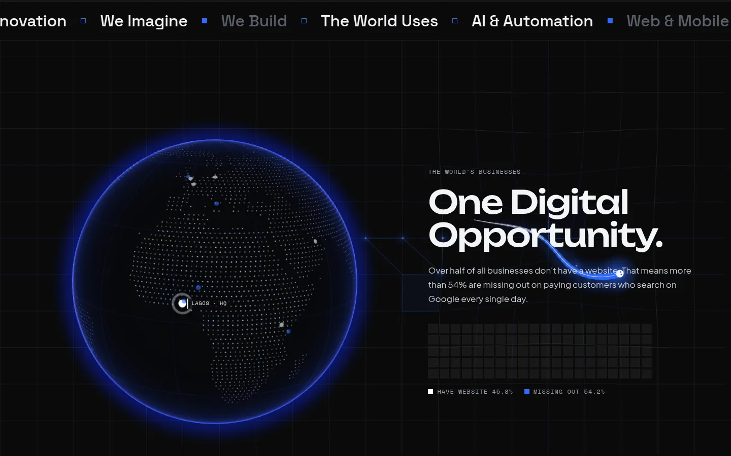
The globe you can drag, with Lagos marked as HQ. The bar underneath splits businesses with and without a website. - 03
Write for the shop owner
The copy avoids tech terms. “You don’t need to know anything about coding or tech” is the first line of the website section, and the three promises under it are the questions owners actually ask: how fast, will it work on phones, do I own it.
Instead of describing a website, that section shows one: a phone with a shawarma ordering site on it. And every call to action sits next to a WhatsApp link, for people who would rather send a message than fill in a form.
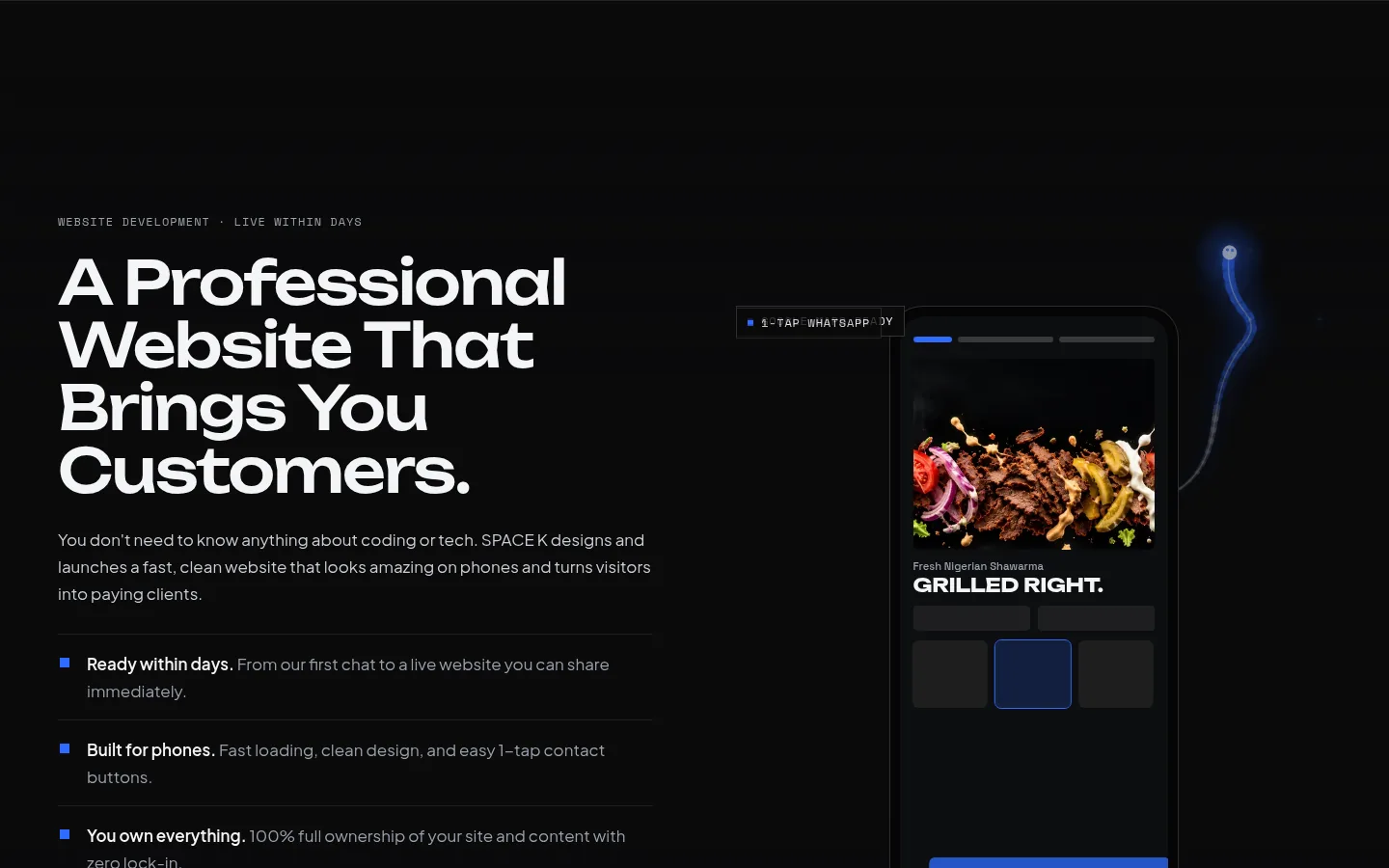
Plain copy on the left, and a real kind of client site on the phone instead of an abstract mockup. - 04
Phones get their own version of each interaction
Hover and drag don’t exist on a phone, so the touch version isn’t just the desktop squeezed down. On a phone the globe turns with a sideways swipe and you tap a market instead of hovering over it. The hint text changes to match.
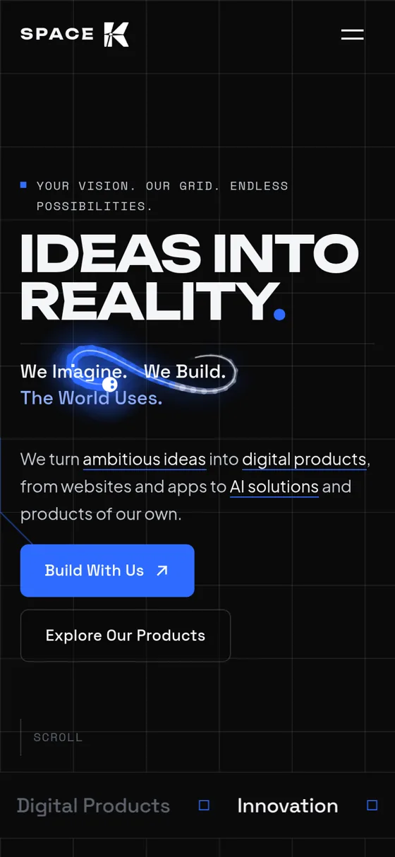
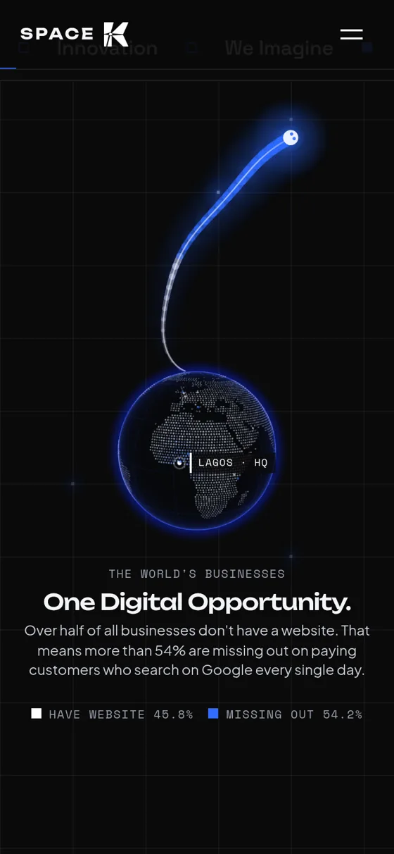
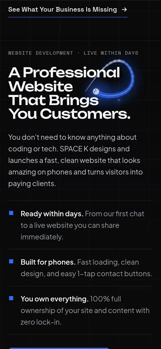
The same three sections at 390 px wide.
Outcome
The site is live at spacek.site. It’s the website on Space K’s Google Business Profile, where we’re listed as a website designer in Lagos, and it’s where I send people when they ask what Space K does.
Since launch it has brought in a few enquiries, which is what it was built to do.
Looking back
Right now the site shows one client project and one product of ours. Next I want to add the other platforms Space K is working on, and more of the websites we build, so the work does more of the talking.