
Case study
Greg’s Mobile Mechanic fixes cars in people’s driveways across Greater Houston. He had 879 Google reviews and a 4.8 rating, and no website. I designed and built the site for them in about two days, using their own reviews, photos and prices.
- Role
- Design and build
- Client
- Greg’s Mobile Mechanic, Houston, Texas
- Timeline
- 2026, about two days
- Tools
- HTML, CSS, JavaScript, GSAP, ScrollTrigger, Lenis
The problem
Someone whose car won’t start is stressed and searching on a phone, often with a tow truck as the other option. Greg’s reviews already answer their questions: he picks up, he tells you the real problem, it often costs less than a tow. But nobody reads 879 reviews.
The site needed to tell that story in the order it actually happens, and put the phone number within reach the whole time.
What I had to work with
- No footage of Greg’s own van or jobs, so the hero film is a rendered sequence, and the footer says so.
- Photos limited to what’s public on his Google listing.
- Every claim had to come from a real review, down to which repairs people mention most.
Key decisions
- 01
A pinned film you scroll through
The hero holds in place while scrolling plays the film: the car, a dive under the hood, the engine bay, the wrench. Three lines change along the way: “Something sounds wrong.”, “We come to you.”, “Fixed in the driveway.” A thin amber bar shows how far through you are.
The look is a dark night garage with a single amber accent, because that’s when a breakdown feels worst.
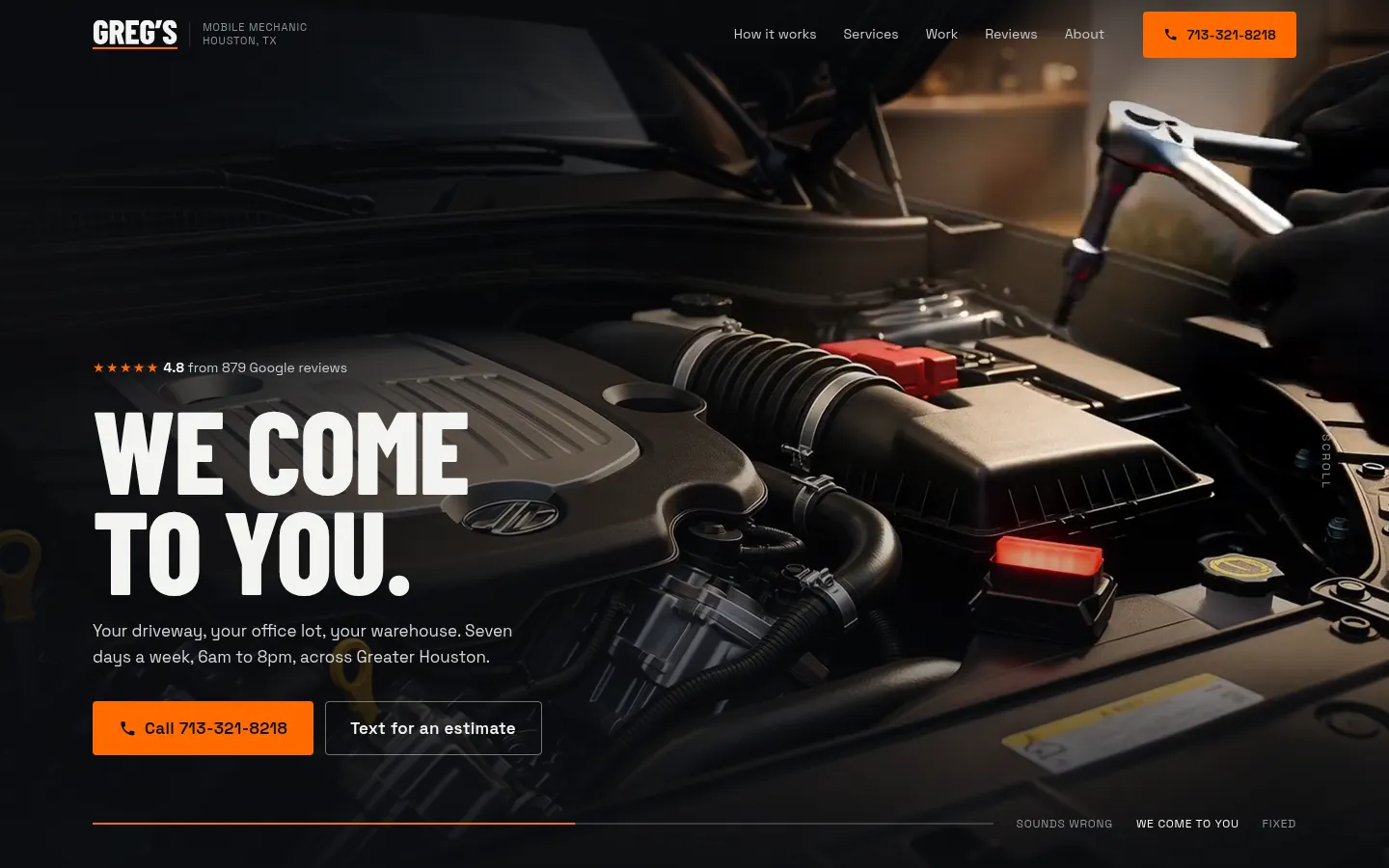
Midway through the hero film: “We come to you.” - 02
Reviews as proof, not decoration
Each service card says how many reviews mention it, so “49 reviews mention alternator replacement” does the selling instead of an adjective. The how-it-works steps follow how Greg’s replies to customers describe a visit, including the customer whose “bad starter” turned out to be a battery.
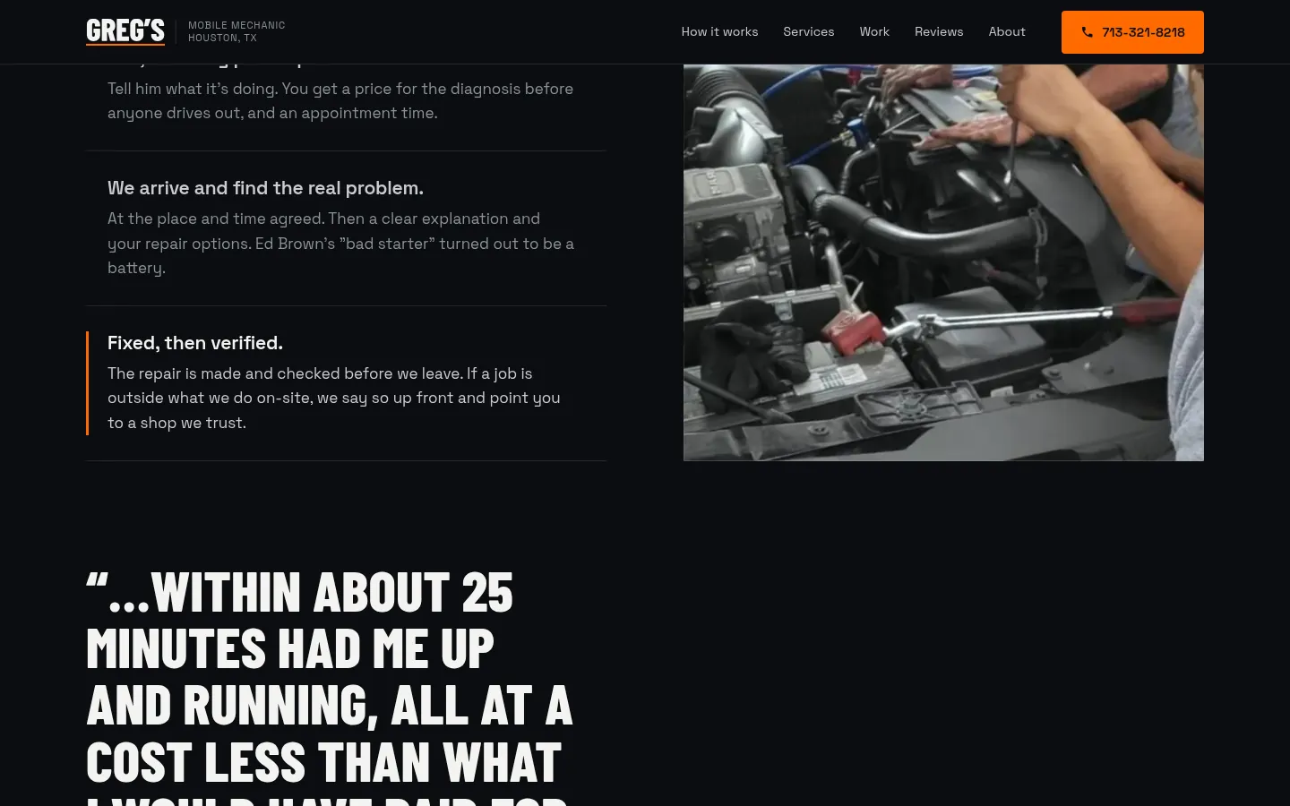
“No tow truck. No guesswork.” The visit, step by step. - 03
Call and text, always in reach
On a phone, Call and Text for an estimate are the first buttons you see, and they stay close the whole way down. Someone stuck on the side of the road shouldn’t have to scroll back up to find the number.
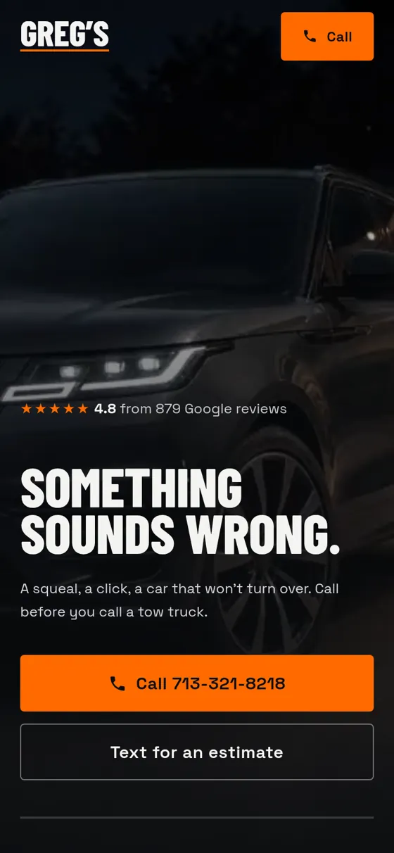
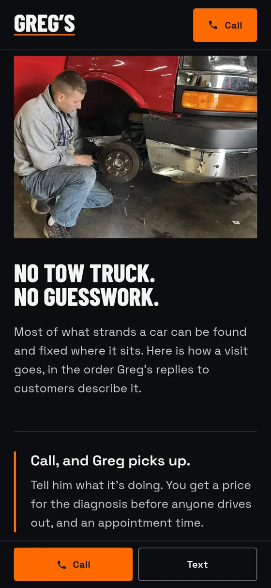
The same site at 390 px wide.
Outcome
Greg’s site was designed and built in about two days.