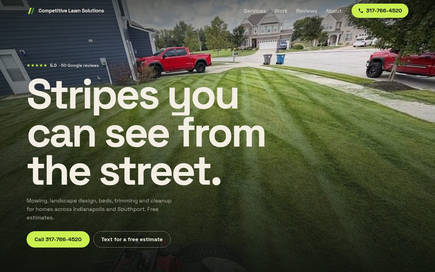
Case study
Competitive Lawn Solutions mows and landscapes yards in Indianapolis and Southport, with a 5.0 rating from 50 Google reviews and no website. I designed and built the site for them in about two days, using their own reviews, photos and prices.
- Role
- Design and build
- Client
- Competitive Lawn Solutions, Indianapolis, Indiana
- Timeline
- 2026, about two days
- Tools
- HTML, CSS, JavaScript, GSAP, ScrollTrigger, Lenis
The problem
Lawn care is easy to judge from the street. A clean, striped lawn is the advert. The crew’s own photos showed exactly that, but they were sitting on a Google listing. The site had to show the work big and make a free estimate the obvious next step.
What I had to work with
- Their real yard photos from Google, at whatever quality they were posted.
- A reference I liked, a scroll-driven site for a power washing company, came with a fair warning in its comments: too much animation hurts conversion. So I set myself a limit.
Key decisions
- 01
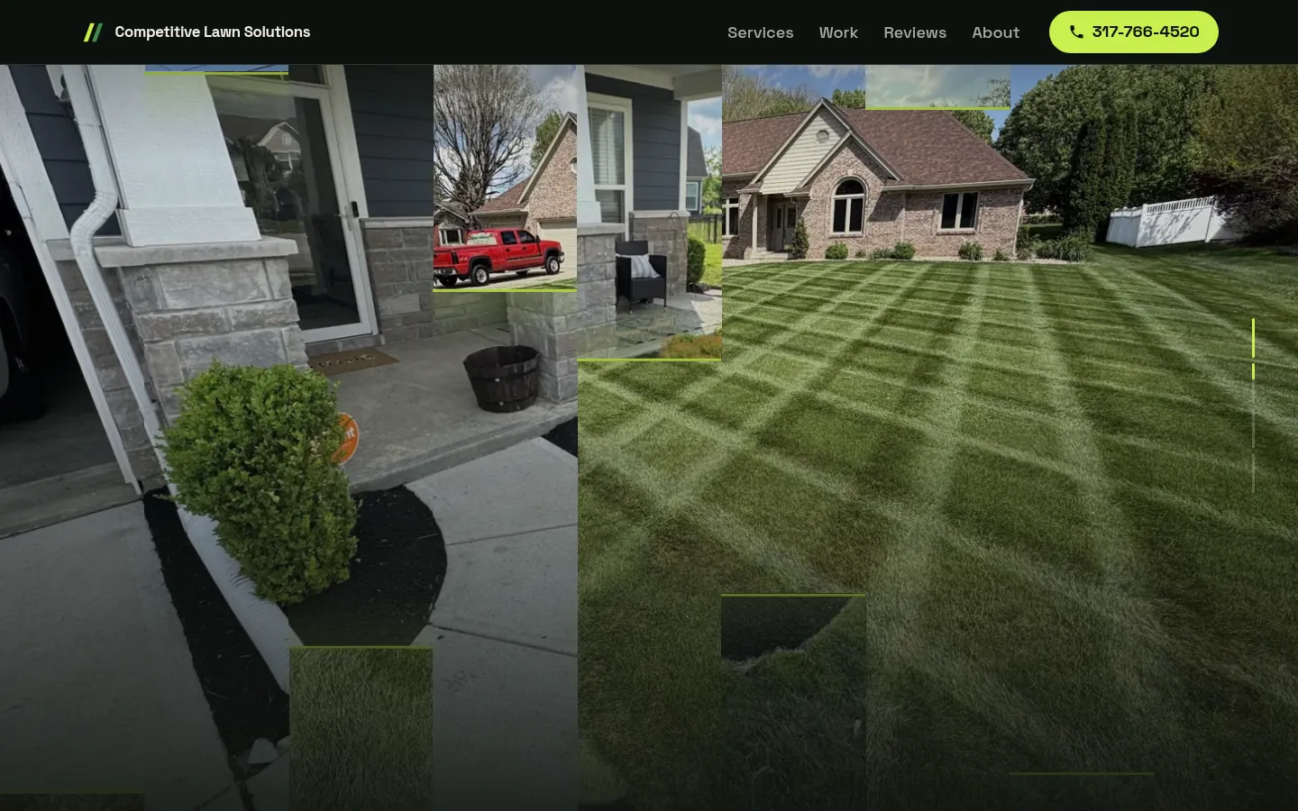
Reveal each scene like a lawn being striped
In the pinned story section, each new photo comes in as alternating up-and-down stripes with a lime edge, like a mower pass, while the headline changes: “Fresh cut.”, “Clean lines.”, “Beds that frame the house.”
The mower-pass reveal, mid-scroll. - 02
Restraint where it matters
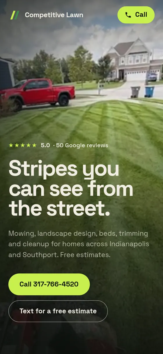
The animation stays in the story and the gallery. The services list, reviews and contact are calm. The Call button never leaves the nav, and on a phone a Call and Text bar appears once you’re past the hero.
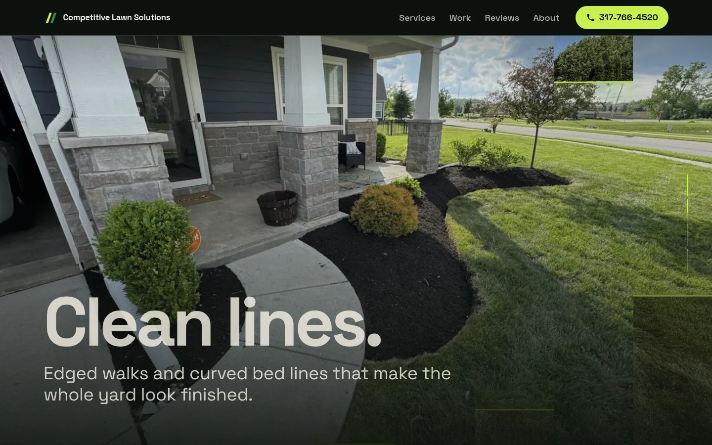
“Clean lines.” A real yard from their Google listing. - 03
Before and after you can drag
A drag-to-compare slider puts the same yard side by side, before and after. It shows the difference better than any line of copy could.
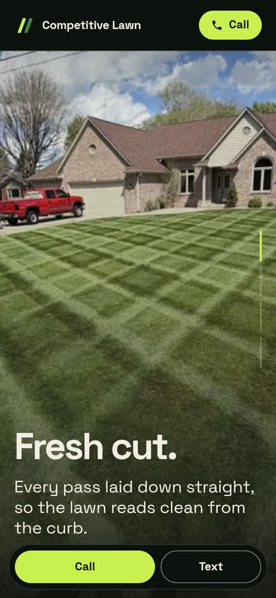
On a phone.
Outcome
I designed and built the Competitive Lawn Solutions site in about two days.