Case study
The Chop House is a barbershop in East Tulsa run by Chevy The Barber, with 463 Google reviews at 4.9 and walk-ins seven days a week. Bookings went through Booksy, but there was no site of its own. I designed and built the site for them in about two days, using their own reviews, photos and prices.
- Role
- Design and build
- Client
- The Chop House Barbershop, Tulsa, Oklahoma
- Timeline
- 2026, about two days
- Tools
- HTML, CSS, JavaScript, GSAP, ScrollTrigger, Lenis
The problem
A barbershop sells a feeling as much as a haircut: sharp lines, the room, the barber. A booking app shows prices and slots, and that’s all. The shop needed a page that feels like walking in, and still gets people to book or call in a couple of taps.
What I had to work with
- Real cut photos from the shop’s Google listing and Instagram, no photoshoot.
- Prices had to match Chevy’s Booksy menu, from the $40 adult cut to the $100 King Package.
- The hero film is a rendered clipper, not footage from the shop.
Key decisions
- 01
Scroll to cut
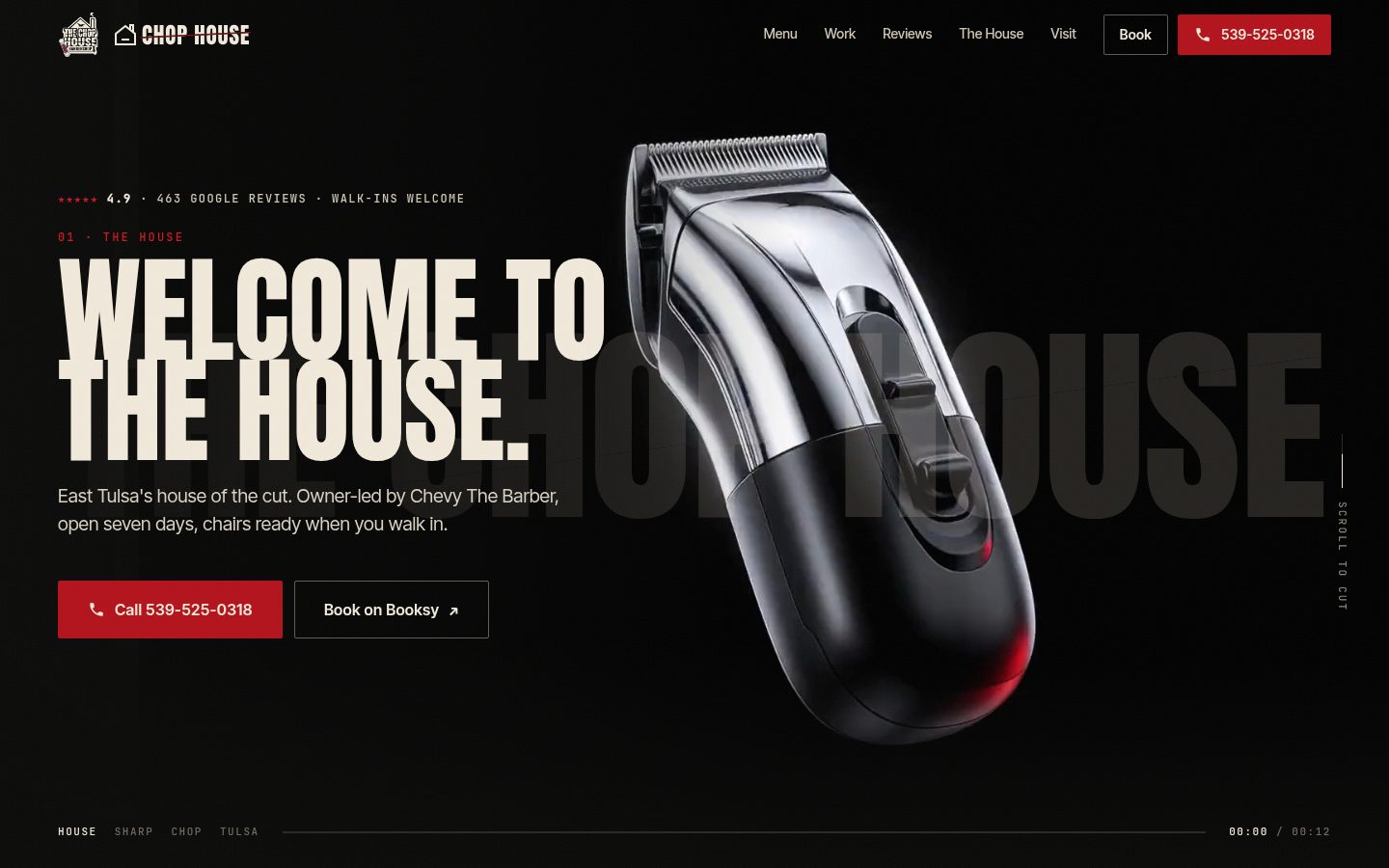
A chrome clipper sits over a giant THE CHOP HOUSE wordmark. As you scroll, it turns blade-first, the LEDs come on and it cuts through hair, with clippings flying off the blade. At the cut, a red diagonal slices the wordmark in two, the same slash that’s in the shop’s real logo. The cut gets the most scroll, because it’s the moment people come for.
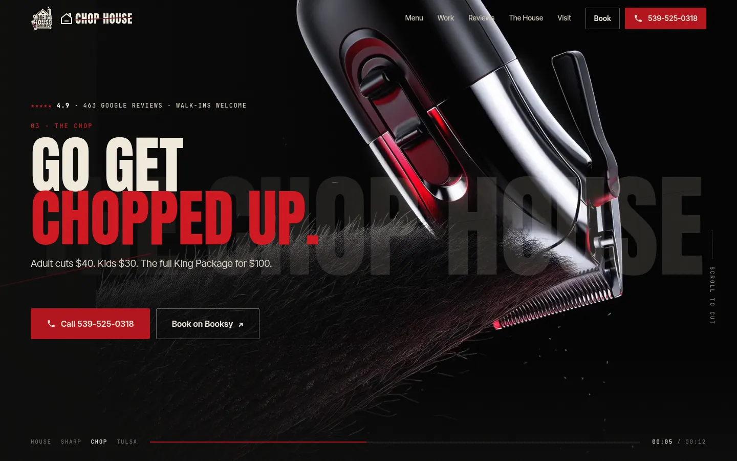
“Go get chopped up.” The wordmark splits along the red slash. - 02
A menu you can read like a price board
The menu is numbered from 01 to 08 with big prices on the right, like the board behind a counter. The King Package gets a crown and spells out what’s in it, down to the Instagram video of your cut and the tee.
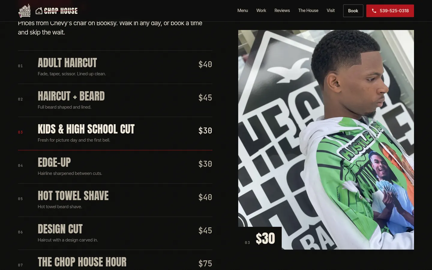
“Pick your chop.” Prices from Chevy’s Booksy page. - 03
Book or call, either way
Some people want a time slot and some just walk in. So Book on Booksy and Call sit side by side all the way down, with the after-hours line for Chevy listed separately.
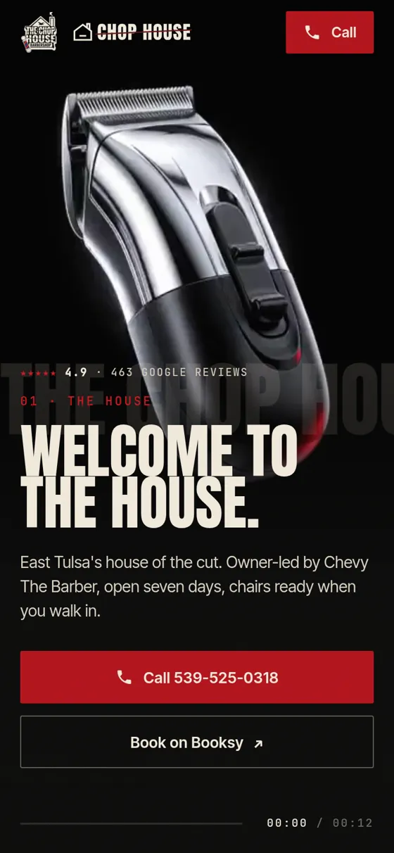
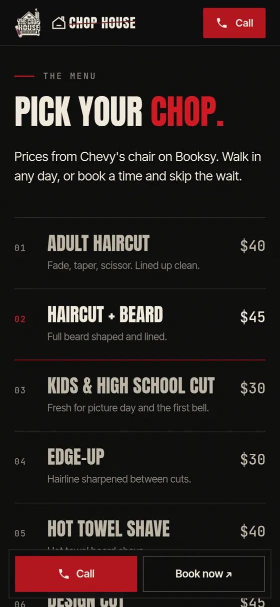
On a phone.
Outcome
The Chop House site was designed and built in about two days.