Case study
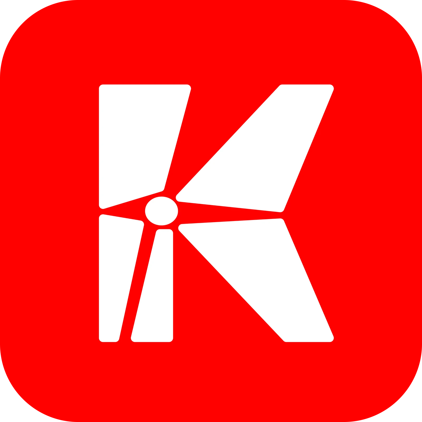
One small detail, a circle where lines meet, ties the Space K logo, wordmarks and monogram together.
- Role
- Brand design
- Client
- Space K, my own studio
- Year
- 2026
- Tools
- Figma
The problem
Space K grew a second side early on: SPACE ACADEMY, for training, starting with a product design bootcamp. SPACE K and SPACE ACADEMY each needed a name that could stand on its own on a flyer or a profile picture, while people still saw one company behind both.
What I did
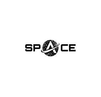
I built everything around a small circle where lines meet. In the K it’s the pivot the two folded arms turn on. In the SPACE wordmark it becomes a planet with an orbit, standing in for the A. In the S monogram it’s the end of a circuit line.
The wordmarks share the same wide, squared capitals, so SPACE ACADEMY reads as part of the same family as SPACE. I drew the K to work at app-icon size and checked it in five colourways, on light and dark backgrounds, so it holds up wherever the brand ends up.
The result
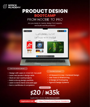
The K is the logo on spacek.site and on Space K’s Google Business Profile. The S monogram became my own mark: it’s the logo in this site’s menu bar and its browser icon, white on blue. The Space Academy flyer was for our first bootcamp. It brought in sign-ups and the bootcamp went well, and we’re planning season two.