Case study
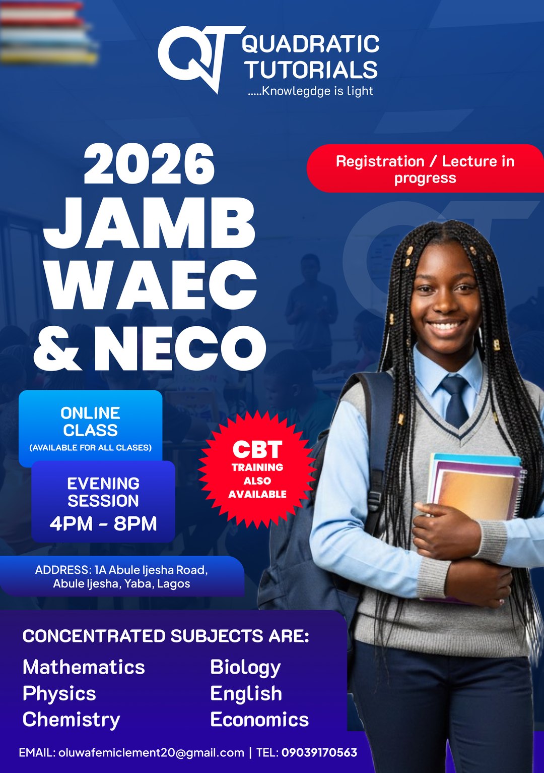
Quadratic Tutorials is a tutorial brand that prepares students for JAMB, WAEC and NECO. I redesigned their logo, then redesigned and upgraded the flyer they already had.
- Role
- Logo redesign and flyer redesign
- Client
- Quadratic Tutorials
- Year
- 2025 to 2026
- Tools
- Figma and Canva
- Pieces
- Logo system, 12 versions, exam-season flyer
The problem
A tutoring brand lives mostly on small screens and cheap printing. A detailed logo turns to mush at profile-picture size, and a single version never suits every background.
What I did
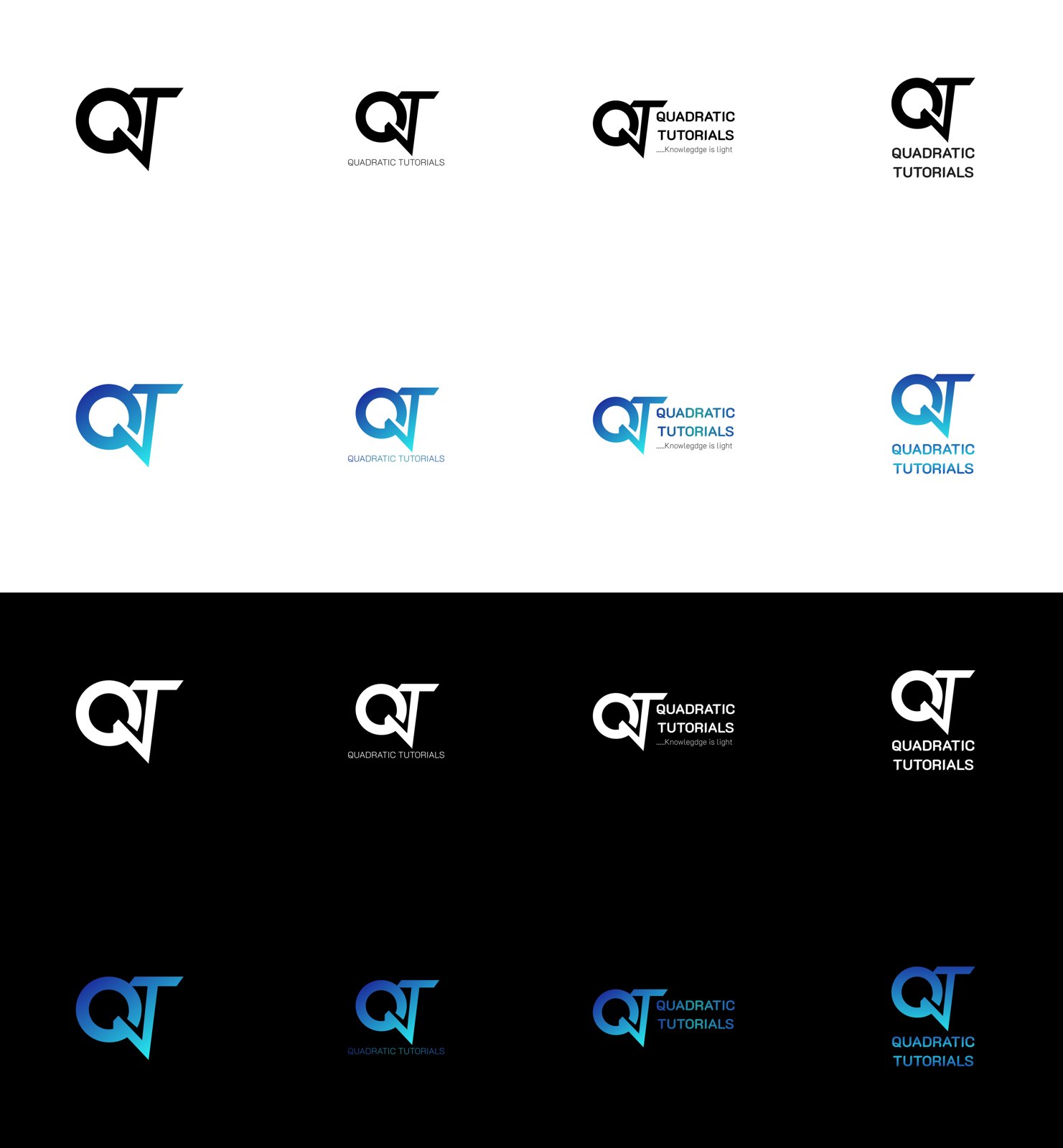
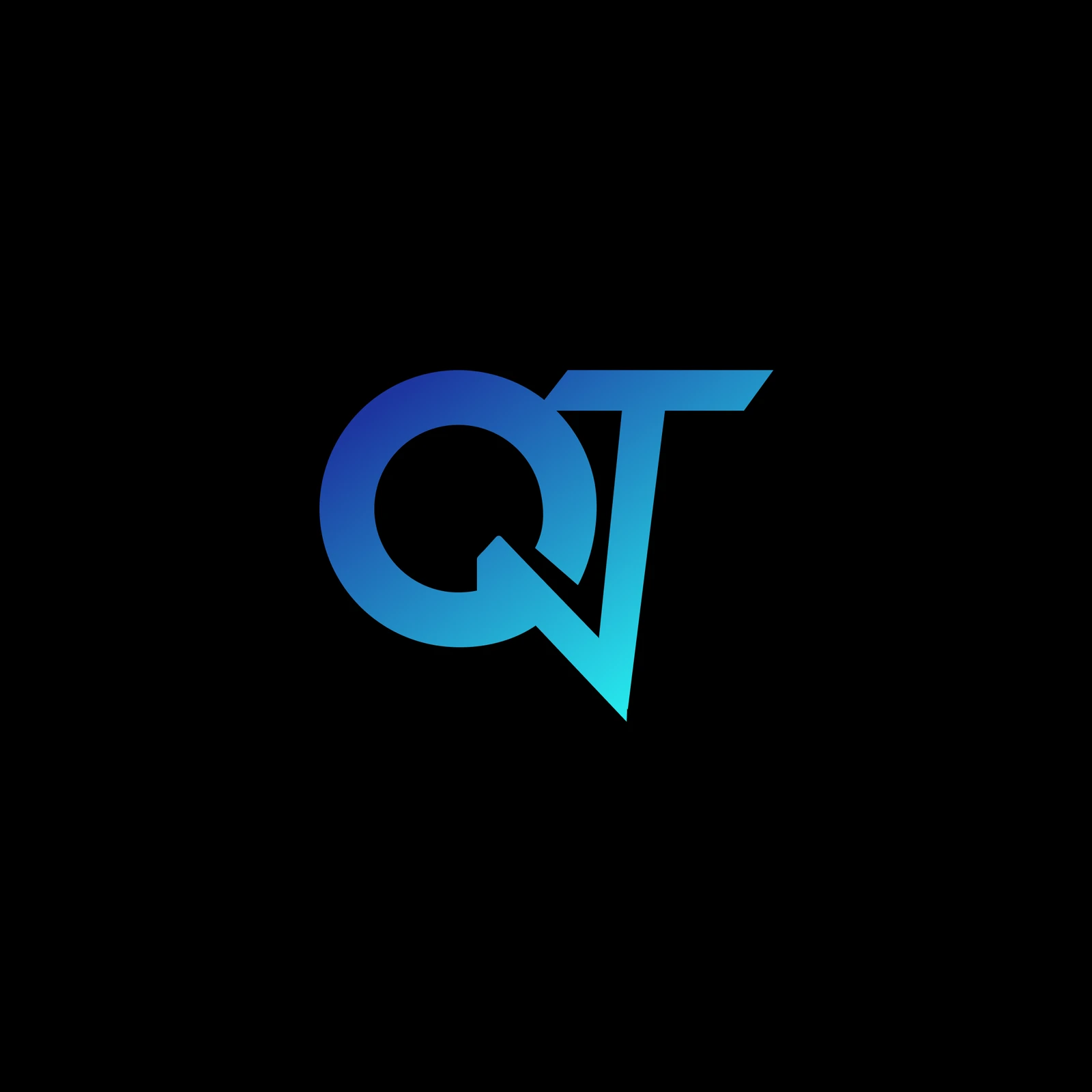
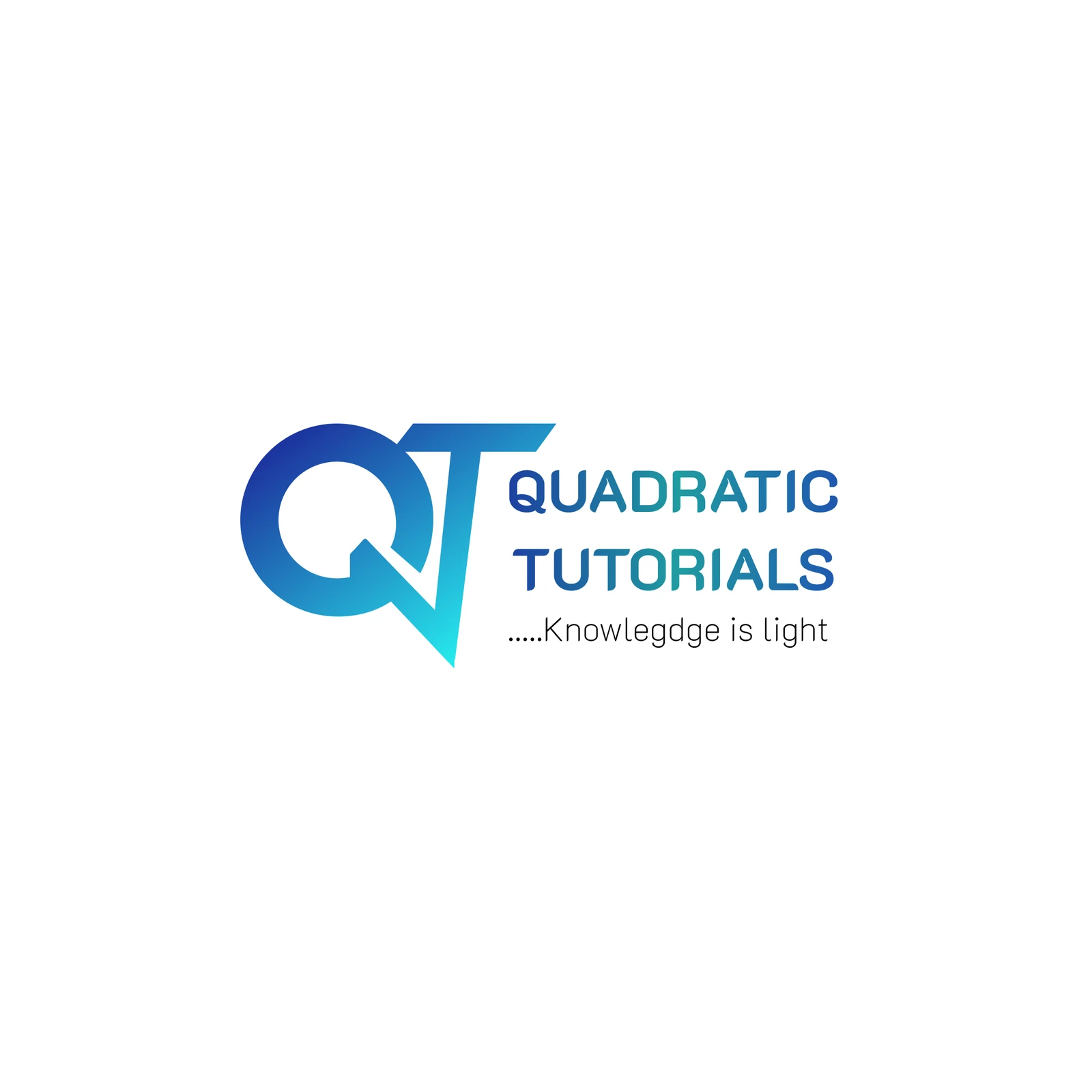
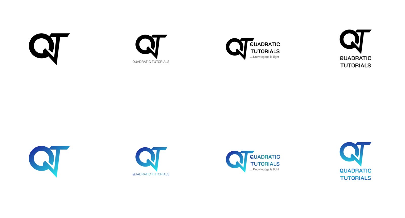
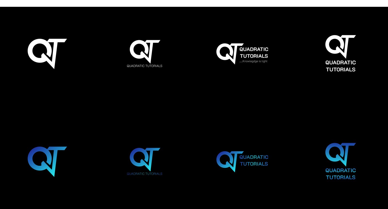
I joined a Q and a T into one mark, with the tail of the Q doubling as the stem of the T. It comes in a blue gradient for colour use, plus solid black and white for one-colour printing. The system has four lockups: the mark, the mark with the name beside it, the name stacked under it, and a full version with the line “Knowledge is light.” Each lockup comes in gradient, black and white versions, on light and dark backgrounds.
Then I reworked their earlier flyer into the 2026 JAMB, WAEC and NECO version: online classes, CBT practice, the subjects covered and the class hours, with a student holding her books as the focus.
The result
A new logo system, and an upgraded flyer for the 2026 exam season that carries it.