Case study
Mexxpay is a payments brand people use for gift cards and similar payments. They hired me as a freelancer to redesign their logo, and I made a few designs for them after that.
- Role
- Logo redesign and graphic design, freelance
- Client
- Mexxpay
- Year
- 2025
- Tools
- Figma and Canva
The problem
A payments brand has to look trustworthy at a glance, and the logo has to stay readable at app-icon size as well as on a poster or a shirt.
What I did
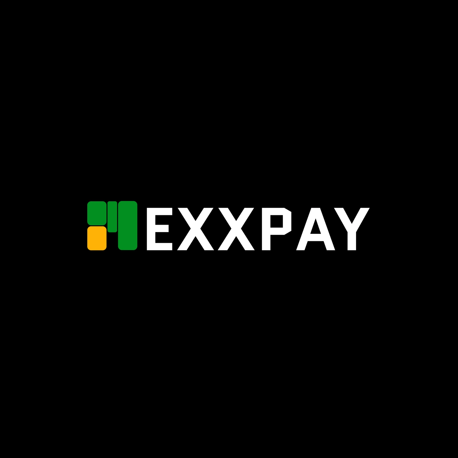
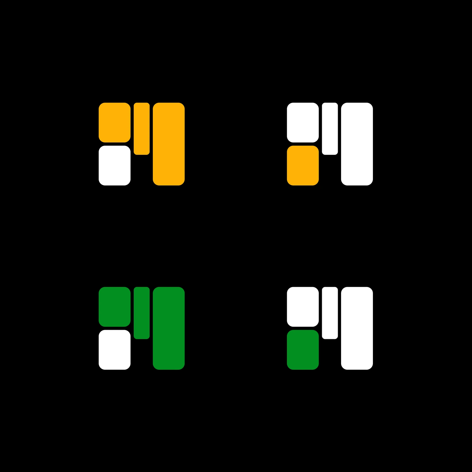
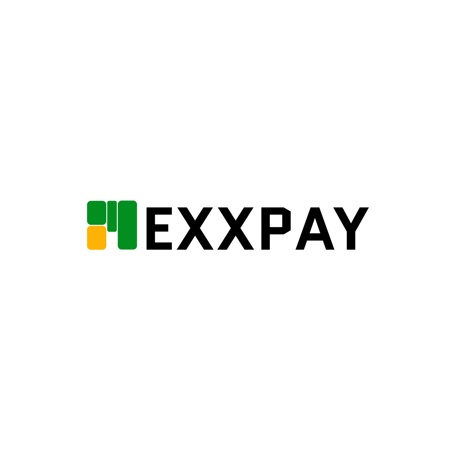
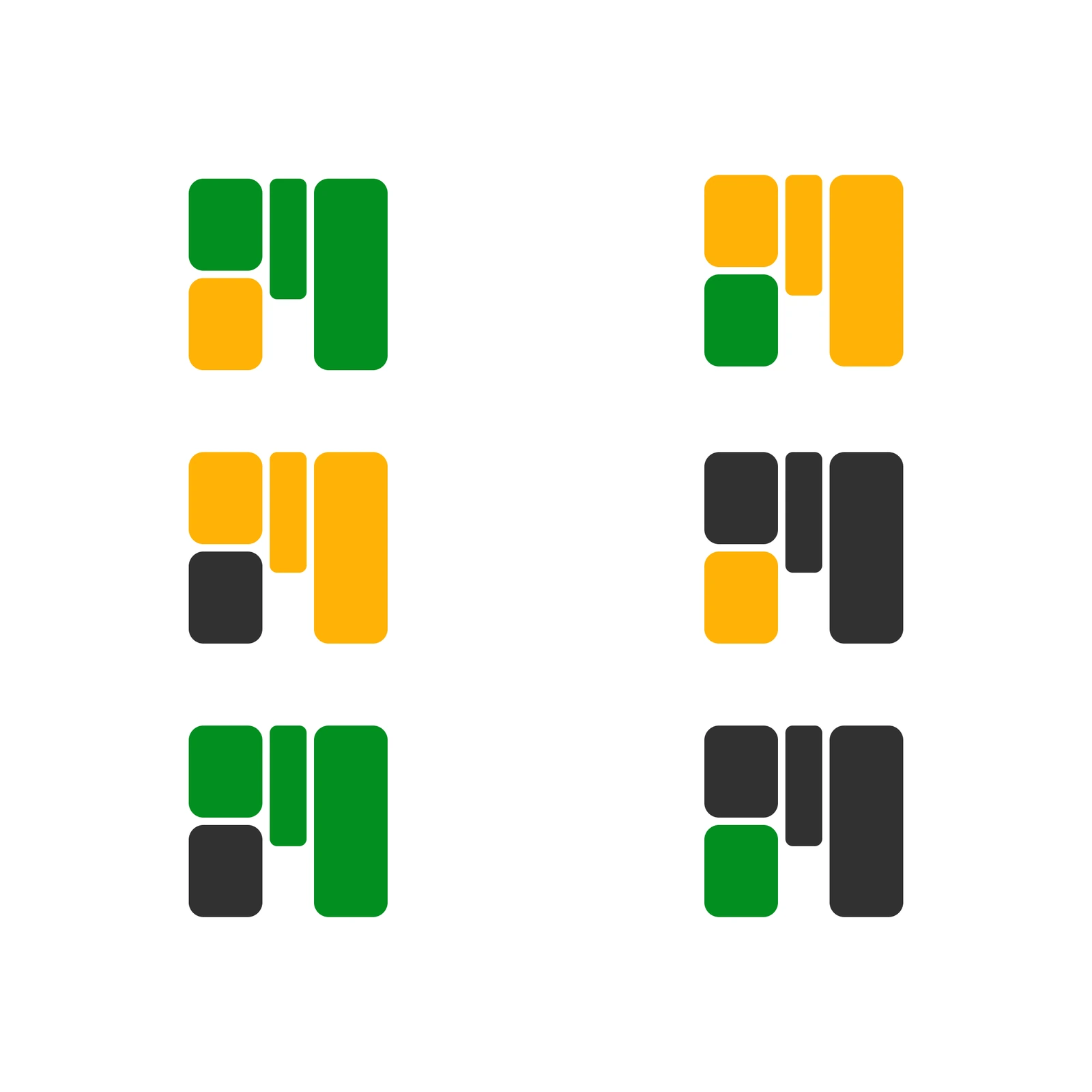
I redesigned the mark from rounded blocks in green and yellow that stack into an M, like bars on a chart. In the wordmark the mark takes the place of the M, so it reads as MEXXPAY. I made it work on black and on white, in full colour and one colour.
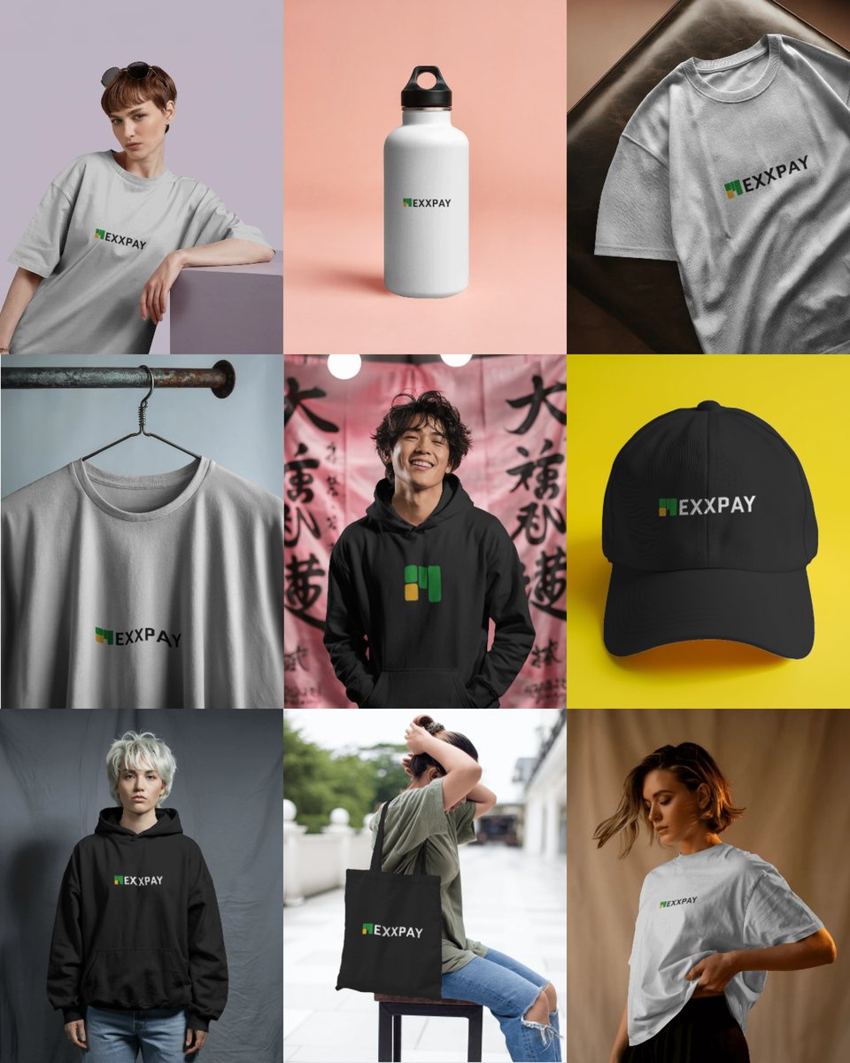
After the logo I designed a poster, “Because you trust us, we keep delivering better every day”, and merch mockups: tees, a cap, a hoodie, a bottle and a tote.
The result
A new logo with its colour and one-colour versions, plus a poster and merch mockups that use it.